Mobile interface
Transaction App
Reviewing account activity on mobile
FIGMA / INTERACTIVE PROTOTYPE
Figma may take a moment to prepare the design. Once it appears, click inside to interact. File viewing permission is required.
A mobile interface for checking balance, deposits and withdrawals by period and spending category.
- MY ROLE
- Interface design
- PROJECT TYPE
- Design project
01 / CONTEXT & OPPORTUNITY
Context before transaction detail
A history alone does not show which period is in view or how spending is distributed. The interface connects account-level context with individual entries.
Financial review depends on maintaining account and time context. Users need to connect the summary, spending categories and transaction entries without repeatedly reconstructing that context.
02 / DESIGN RATIONALE
Period, category and transaction rows
Month selection sits above the summary. A chart shows category distribution and a repeated row structure makes amounts and transaction types easier to scan.
Repeated row structures support comparison. Chart and color cues need text labels so transaction types do not rely on color alone.
03 / DESIGN IN PRACTICE
One account-review view
The screen starts with the selected period and account status, then leads into individual activity. The bottom navigation keeps the view anchored in the wider app.
Selected design details
04 / NEXT STEPS
Proposed evaluation and implementation considerations
Proposed tasks include finding a withdrawal in a specific month and explaining a category's share. Empty history, loading errors and variable amount lengths are important implementation states.
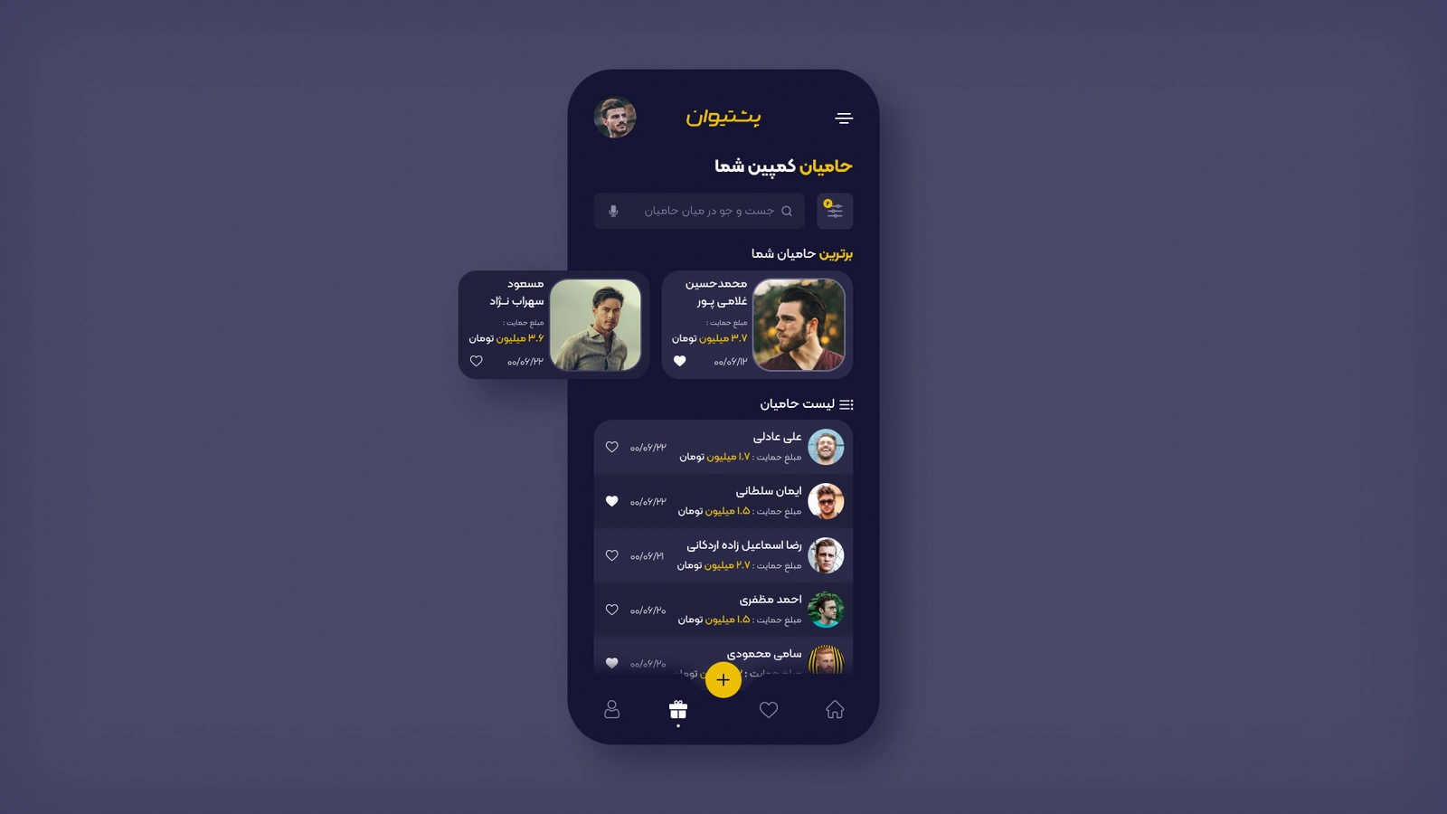
Campaign Supporters
Interface design exercise

Honar Koodak
Design study presentation
Ready for your product’s next chapter?
Let’s talk